
CASE STUDY
Translating complexity into clarity
A pioneering grant-giving organisation needed a brand that reflected who they truly are – supportive, discreet, and deeply committed to impact.
Risk Pool Alliance helps impact-driven programmes stay on track when unexpected challenges arise. They work across health, education, livelihoods, and humanitarian aid, providing rapid, discreet support so vital work can continue.
Their model is innovative, their mission is urgent. But their story wasn’t landing.
Client
Risk Pool Alliance
Sector
International development
Services
Brand Strategy, Visual Identity, Website
Duration
12 Weeks
Duration
12 Weeks
The Challenge
The work sits at a complex intersection: funders and implementers, discretion and transparency, speed and rigour. Every conversation required context, every introduction started from scratch, funders who spoke on their behalf weren’t sure what to say.
The existing black and red visual identity felt harsh, when the organisation itself was anything but. They needed something that reflected who they actually are: warm, pragmatic, and deeply respectful of the sensitive situations they navigate.
Every conversation started from scratch. Funders who spoke on their behalf weren’t sure what to say.
What we uncovered
Discretion wasn’t just part of how they worked. It was central to their value. Implementers need a safe space to flag challenges without fear. Funders need confidence that sensitive situations are handled quietly. Risk Pool Alliance holds that trust – and it had never been clearly articulated.
Once we named it, the rest of the strategy came into focus.
How we worked together
STRATEGY
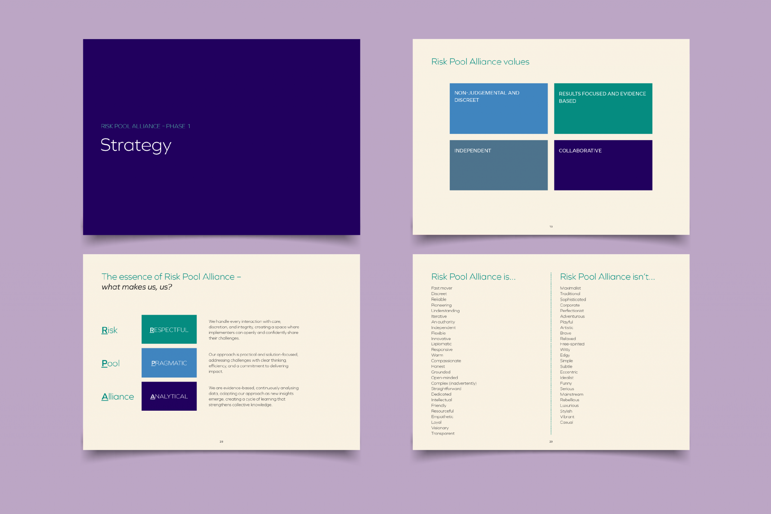
We explored vision, values, positioning, and audience. We developed messaging, tone of voice, and brand archetypes. The output was a comprehensive strategy document, and a one-page blueprint that distilled it all into something the whole team could use.
VISUAL IDENTITY
We created a new brand that felt calmer, kinder, and more aligned with their supportive nature. A palette and system that could grow with them. All printed materials were produced using sustainably sourced paper and environmentally friendly inks.

This was collaborative from the start. Shaped together, so it felt right – and so they could carry it forward with confidence.
What changed
What began as a single health-focused fund has expanded into four impact areas – health, education, livelihoods, and humanitarian aid – each with a coherent identity that scales.
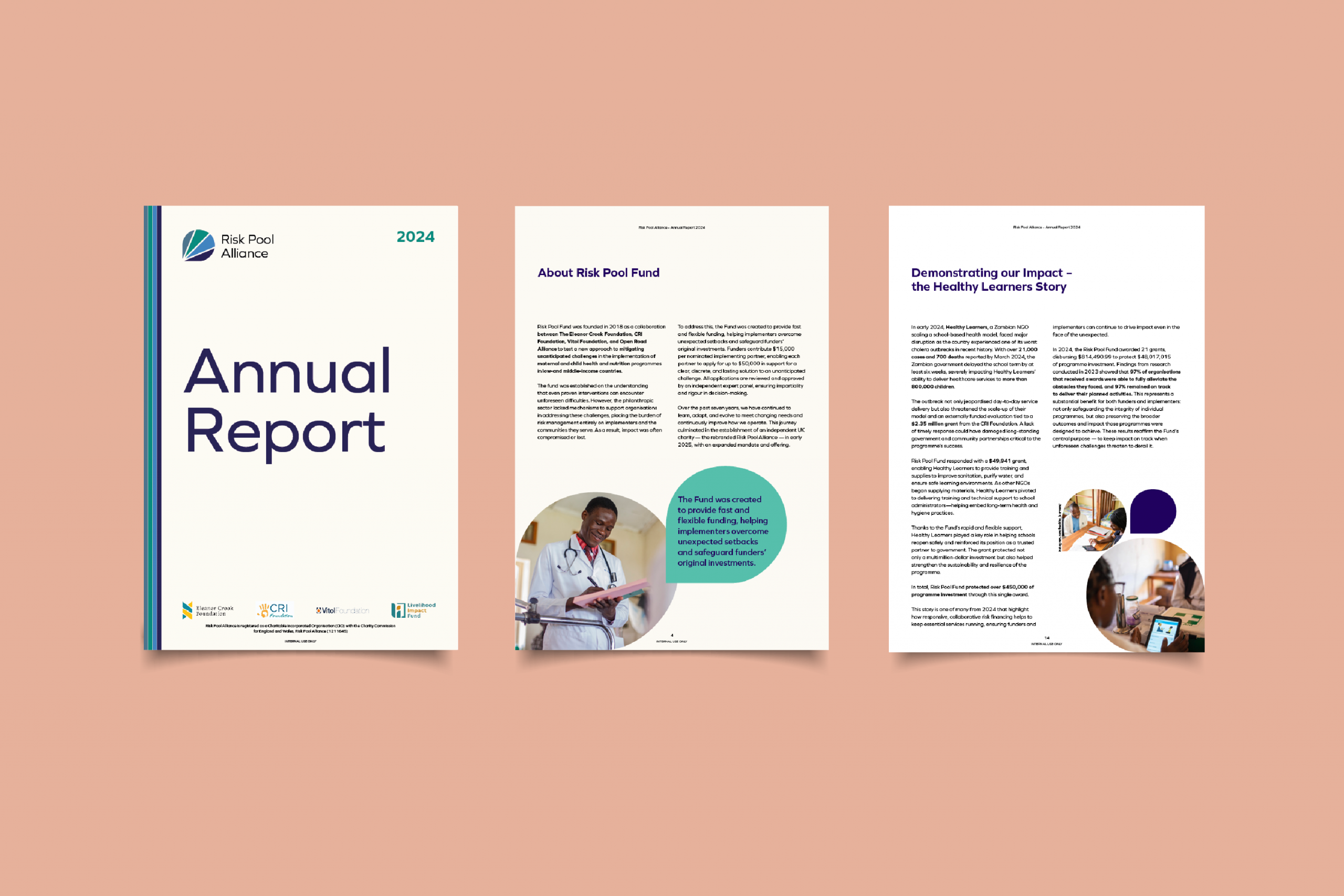
And the work continues. We now support Risk Pool Alliance with impact reports, annual reports, social media, and email newsletters – building on the foundation we created together.
Testimonial Here
Name Here